Welcome to UX Story Island
This week, I was moderately productive. I ran an unmoderated study aimed at spotlighting the assumed friction points of a specific part of the company website. And oh boy, did it yield some powerful feedback.
I took the opportunity to create a sizzle reel of participant feedback to better tell the story and show why all of these pain points together result in such emotional responses. Putting together different edits of that video in Adobe Premier took the bulk of my week. Still unsure how and when it will be shared with leadership and gain support for improvements.
Meanwhile, this week in Save the Cat! I didn't get very far. But I started learning about the concept I am most interested in: story structure. The chapter quickly dives into the beat sheet, which Blake Snyder illustrates as a series of islands that help the audience jump from the beginning of a story to its end.
I appreciated the metaphor Snyder used to describe how his early movie pitches that focused on a few cool scences. As he put it, this tactic left a lot of "open water" – leaving his pitch listeners to "swim" in multiple directions to fill the space with their own ideas for what the story should be. The beat sheet eliminates this by providing several definitive "islands" with little water in between.
The first beat is the "Opening Image," and this line from the second paragraph got me thinking.
… the opening image has a matching beat: the final image. These are bookends. And because a good screenplay is about change, these two scenes are a way to make clear how that change takes place in your movie.
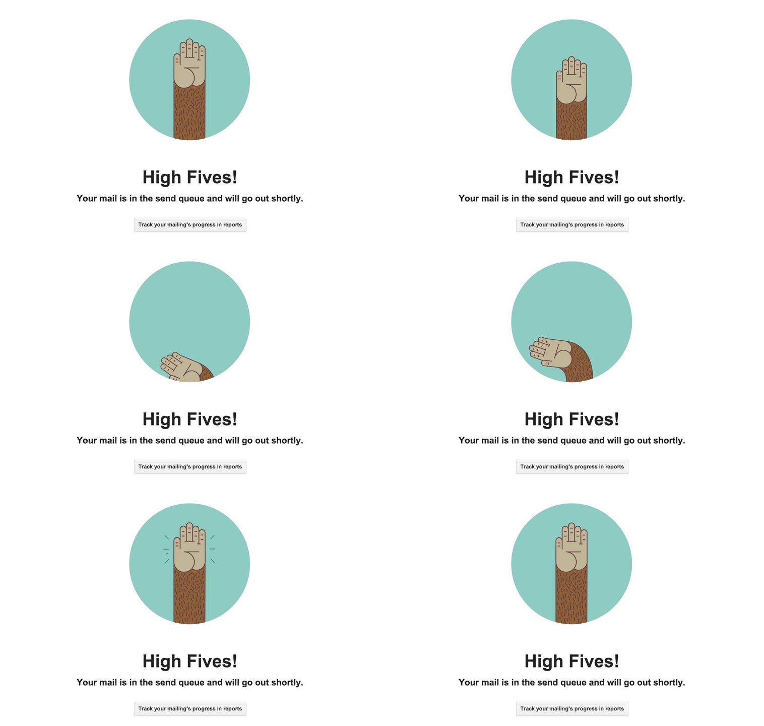
To me, this seems like a way begin framing up or storyboarding a prototype for a project that a UX consultant or consultancy may pitch to a business. After doing some research on a target audience and their needs, you'll understand the problem. Now, what will it look like after those people have solved their problem using your product or service? That's the final image. If it's a software prototype, the final image may be a dominant success screen, like what MailChimp does when someone queues up an email to send.

Links
- Success States Design: From Nick Babich via UX Planet. "Every user interaction with a product can be described as a story." This is where I found the GIF above. And how serendipitous that it describes the very thing I'm talking about.
- How to tell a captivating story — from a wedding toast to a job interview: This came up on NPR during my house-hunting condundrums. I'd bookmarked it but still haven't read it.